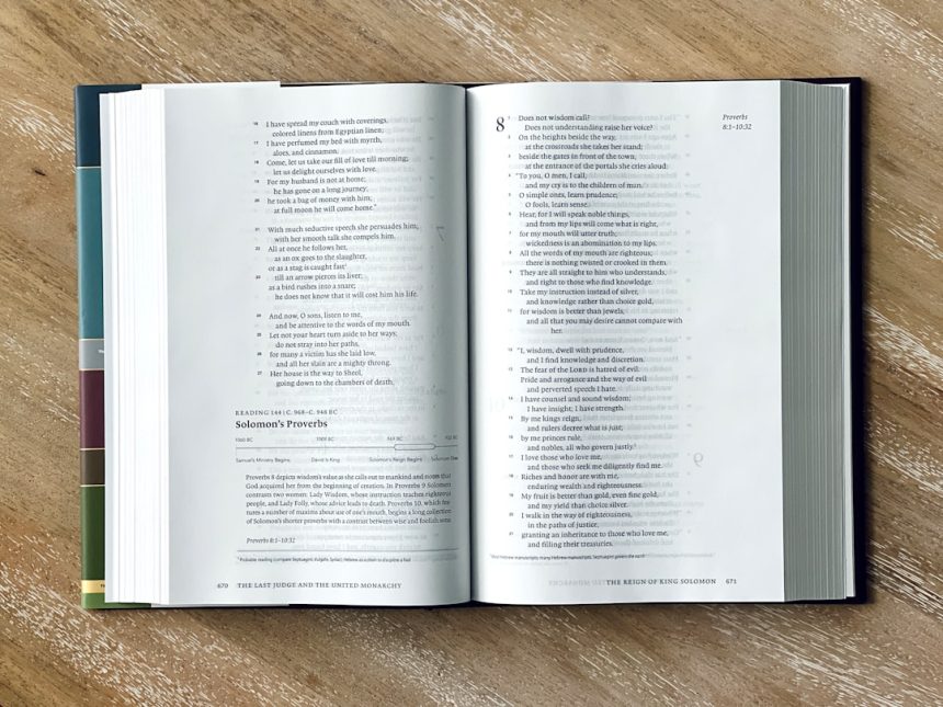
When designing a double-sided brochure, one of the most overlooked yet critical elements is font size. While color schemes, layout, and imagery often take center stage, your brochure’s effectiveness hinges significantly on how legible and readable the text is. Choosing the right font size can make the difference between a message that resonates—and one that gets ignored.
With only a limited space to convey your key messages, and just a few seconds to grab your reader’s attention, font size plays a pivotal role in ensuring your content is accessible and visually appealing. In this article, we’ll explore the key factors to consider when selecting font size for a professional, double-sided brochure.
1. Understand the Purpose and Audience
The first step in choosing the perfect font size is determining who will be reading your brochure and what action you want them to take. For example:
- Corporate brochures: Typically require a clean, professional font between 10pt and 12pt for body text.
- Event flyers or promotions: May benefit from slightly larger fonts (12pt to 14pt) to stand out and quickly grab attention.
- Senior citizen audiences: Should use at least 14pt or larger for easier readability.
Always keep the audience’s age and reading situation in mind. If the brochure will be read in low-light environments or by an older demographic, scale your fonts accordingly.
2. Choose the Right Hierarchy
Creating a clear hierarchy of text ensures your readers instinctively know what to look at first. Here’s a general structure you can follow:
- Headlines: 18pt to 24pt — eye-catching and bold
- Subheadings: 14pt to 18pt — provide organization
- Body Text: 10pt to 12pt — readable and concise
- Captions and Disclaimers: 8pt to 10pt — minimized, yet legible
Maintaining consistency between these different text elements is crucial. You shouldn’t have a headline that looks smaller than a subheading, and you should avoid using multiple sizes of body text within the same side of the brochure.
[ai-img]brochure layout design text hierarchy[/ai-img]
3. Consider the Brochure’s Dimensions and Format
The physical size of your brochure will have a direct impact on your font size choices. A typical tri-fold brochure on A4 or letter-sized paper means you only have narrow panels to work with. Printing on glossy or matte paper may also influence readability.
Here are some recommendations based on brochure format:
- Tri-fold (A4): Use 10pt–12pt for body, and no more than 24pt for headings.
- Z-fold: Slightly more space available — 12pt body text is suitable.
- Half-fold: Offers wider columns — use this opportunity to add spacing and maybe slightly larger fonts.
Remember that the margins, spacing between lines, and visual breaks also influence how the font size looks. What seems fine on screen may look cramped in print.
4. Test for Legibility and Print Accuracy
Before sending your brochure to print, perform a thorough test:
- Print a full-size mockup on your office printer, even in black and white.
- Look at it from a reader’s perspective — is the body text easy to read from 12 to 18 inches away?
- Check on multiple types of lighting. Some fonts and sizes that look fine under bright office lights might be difficult to read elsewhere.
It’s common for digital designs to appear larger and crisper than they do in print, so it’s a good idea to go slightly larger than what looks “perfect” on screen.
[ai-img]print test brochure font size readability[/ai-img]
5. Leave Room to Breathe
Even with limited space, don’t be tempted to cram text into every available inch with smaller fonts. One of the golden rules of good brochure design is white space. Clean layouts with balanced margins and spacing between paragraphs increase readability and keep your layout sophisticated.
If you must include a lot of information, consider using bullet points or infographics instead of dense paragraphs in tiny fonts. Prioritize quality of communication over quantity of information.
Key Takeaways
When choosing the right font size for your double-sided brochure, remember:
- Always keep your target audience in mind.
- Use a visual text hierarchy to guide readers through the content.
- Test legibility and spacing in print before finalizing the design.
- Avoid overcrowding; use white space wisely for an elegant and effective design.
[ai-img]double sided brochure professional print design[/ai-img]
By paying attention to these details, you’ll ensure your brochure doesn’t just look good — it communicates your message clearly and powerfully.